How to Choose The Right Website Color Scheme? [Quick Guide]
You spend extra time picking up an amazing layout, publishing high-quality, unique content. But, still not able to drive the sales funnel.
Wait! Have you checked the color scheme? Color psychology for web design can have a significant impact on conversions. Do you know people make buying decisions for products in just 90 seconds? And, 90 percent of the decision-making is based on colors.
When a user completes a form, signs up for a newsletter, or hits the “Buy Now” button on your website, it shows your website offers a great user experience. After all, your primary goal is to make users take an action on your website you want them to. And, the color scheme can play a key role in this.
No matter whether you are developing a new website or updating the existing one, choosing the right color scheme is important. Now, you might have the following questions roaming in your mind-
➔ Why does color psychology matter?
➔ What is the psychology of different colors?
➔ How do I know what are the best colors for my website?
➔ What are the best tools to choose the right color scheme for your website?
Let’s discuss all these points in detail.
Also Read– Do You Need to Create an ADA-Compliant Website?
Why is Color Scheme Important For a Website?
Color psychology plays a key role in influencing human behavior. Different colors have different meanings, thus they evoke different emotions. So, you can make your visitors take the required actions on your website only if you use the right color scheme.
Colors enhance brand recognition, highlighting important elements of your website and influencing how your visitors feel about your brand. Other than color schemes, white space and contrast are other vital elements of a good website design.
When it comes to using color psychology for marketing and advertising, the main focus is on selecting colors, which persuade customers to make purchases on your website.
So, while designing your website, make sure you use colors carefully so that it can hold the attention of first-time visitors. Keep reading to learn about the color psychology chart and how to select the right color scheme for your site.
What is Color Psychology in Web Design?
Colors and emotions are interlinked. Different colors spark different emotions. Warm colors evoke feelings of happiness and energy while cool colors deliver soothing, calming effects. In fact, studies have shown that colors can be about 85 percent of the reason people make buying decisions.
Before we jump into the best color scheme for your website, let’s learn about the psychology of different colors first.
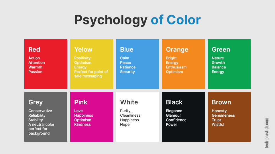
Red Color Psychology
Red is one of the most visible colors in the spectrum, and it attracts the most attention. It also signifies passion, drama, power, and aggression.
Since it promotes action, most web designers recommend using it for call-to-action buttons.
Also Read- Mobile-First Approach (MFA) – What You Need to Know?
When to Use Red
Want to draw the attention of your visitors to a particular piece of content on your website? Use this color. Red can be used for websites related to various niches such as food, fashion, marketing, sports, advertising, etc.
When NOT to Use Red
Using red for hover won’t hurt your web design if done right. If you use too much red color, it will make your website look too aggressive. If you are providing professional website services or luxury goods, avoid using red color.
Orange Color Psychology
Orange is a tricky color, so you should use it strategically. It signifies energy, excitement, and enthusiasm. It’s listed among the kids’ favorite colors; most adults also love it. So, if you are targeting adult buyers, you can use orange for web design.
When to Use Orange
If you want to portray energy & power, then orange is the right color for you to use for web design. It can be a great option when it comes to mixing a warm color in the cold color palette. Orange is also a great color for CTAs. Black and white always go well with orange in web design.
When NOT to Use Orange
It’s difficult to use orange with warm colors, such as yellows and reds. Additionally, you should be careful when using orange for text as it can be difficult to read.
Yellow Color Psychology
Yellow is a warm color that is associated with energy, happiness, and sunshine. It offers hope, and uplifting effects.
Yellow boosts creativity levels when considered from the mental aspect. Thus, it can help generate new ideas and find innovative ways to solve problems.
When to Use Yellow
Bright yellow can be used for creating a sense of happiness or energizing visitors. However, light yellow is preferred by web designers for visitors to generate calm, happy feelings.
Also, you should go for yellow if you want to catch your visitors’ attention to a specific CTA.
When NOT to Use Yellow
You should be very careful when using yellow for web design as it becomes overpowering quickly. Remember, too much yellow can cause anxiety, nervousness, and agitation.
Blue Color Psychology
Blue is often used for evoking relaxing and calming emotions. It’s also associated with feelings of loyalty and strength. That’s why the majority of information technology and security companies prefer blue for web design.
When to Use Blue
You might have noticed that social media giants such as Facebook, Twitter, and LinkedIn all use blue color. This color is often preferred by financial institutions and large organizations.
When NOT to Use Blue
Blue curbs appetite, so it’s not a good option for food-based websites. Also, you should avoid using too much blue for web design as this can make your website feel cool.
Green Color Psychology
Green is associated with nature, growth, and balance. If we talk about dark green, it signifies wealth and prestige. On the other hand, light green relates to freshness and growth.
The major reason why this color is popular among business people is that it has relaxing qualities of blue and energizing effects of yellow.
When to Use Green
Use green if you are looking for an environmental-friendly, health-related theme. Green is the right choice if you want to create calming, relaxing effects or represent wealth and a new beginning.
When NOT to Use Green
Avoid green for web design if you are selling luxury or tech products.
Gray Color Psychology
Gray represents professionalism and sophistication. It’s one of the neutral colors that is usually used for the background.
When to Use Gray
Gray color is perfect for web design if you are developing a professional website for selling luxury goods. It helps make a calming, balancing effect.
When NOT to Use Gray
Some shades of gray are dull, thus they are not perfect for attracting visitors’ attention. So, seek professional help from a website designer to incorporate this color in website design.
Pink Color Psychology
Pink is related to love, kindness, and sincerity. Some experts say that this color evokes feelings of happiness and joy. Some of the popular brands using pink are Barbie, PINK, T-Mobile, Lyft, and Pink Floyd.
When to Use Pink
Pink is a great color if you are selling feminine products or if your target audience is young girls or women. It’s often preferred with red for the background by designers.
When NOT to Use Pink
Since pink has a strong association with women, you should avoid this color if you are targeting men. Also, it’s necessary to use the right color combinations with pink.
White Color Psychology
White signifies purity, cleanliness, safety, and happiness. It offers a sense of calm and peace.
When to Use White
This color is good for websites associated with the healthcare industry. You can also use white for websites related to science and the latest technology. When paired correctly, this color is perfect for websites providing luxury goods.
When NOT to Use White
Although white can be used for any website, you should be careful when pairing it with other colors. Have any questions about using white for web design? Contact our website designers.
Color Wheel
There are 12 colors present in the color wheel. By understanding color wheel psychology and how colors relate to each other, it becomes easier to select color schemes that will work perfectly for your website.
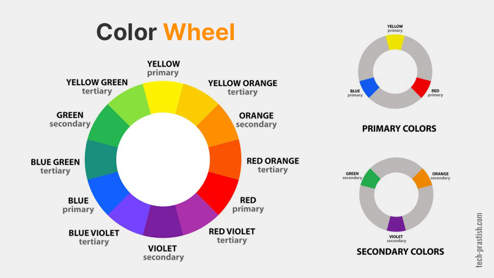
Primary Colors
Red, Blue, and Yellow. These can’t be created by mixing other colors. But they can be combined to create secondary and tertiary colors.
Secondary Colors
Secondary colors are created by mixing two primary colors in equal amounts at a time.
For instance, Red + Blue = Purple
Tertiary Colors
Tertiary colors are created by mixing primary and secondary colors in equal amounts.
For instance, Red + Purple = Red-Purple
Quick Tips to Choose The Best Color Schemes For Your Website
Here are some tips to help you know how to choose a color scheme for your website–
Learn Color Psychology Basics
As discussed in the previous section, different colors evoke different emotions. So, you need to learn color psychology basics to understand what will work for your website.
Color associations are great; remember we used to develop those in childhood. Usually, these associations are subconscious. However, some are universal. For instance, yellow is associated with the sun.
Thus, by learning color psychology basics, you can easily determine what are the right color schemes for your website.
Analyze Your Target Audience
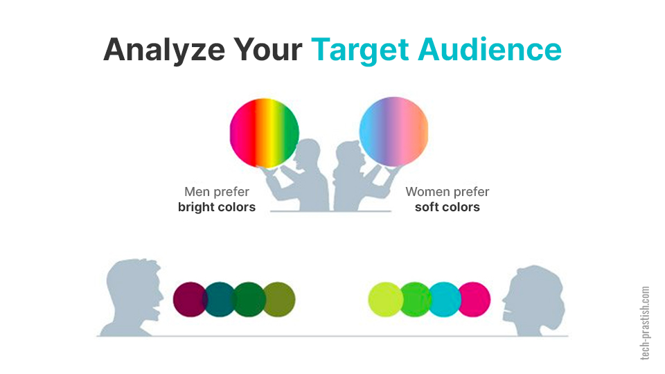
In the business world, you have to focus on your customers’ preferences rather than yours. So, make sure you get the answer for – who are you targeting to?
Research shows that a site’s visual appearance plays a key role in its conversion. You need to work with web designers to make your website visually appealing. This way, more visitors are able to connect to it and take the actions you want them to.
According to data from different studies published on Kissmetrics, 57 percent of men and 35 percent of women said that their favorite color is blue. 27 percent of men agreed that brown is their least favorite color while 33 percent of women said that their favorite color is orange.
If your target audience is men, it’s good to choose blue, green, black, and red colors for your website.
In simple words, you should provide what your audience loves. Choose colors that they love. Talk in their language and answer their queries. This way, you can easily connect with your potential customers and increase sales.
Check Which Colors Work in Your Industry
While beating the competition is one of the key challenges, you need to choose what works in your industry. It’s important to note that not all colors work well for all industries. For instance, blue is usually preferred by financial institutions while red is often used by dating websites.
So, Which Colors Are Best For Your Industry?
Check out the list below, and find out what colors are perfect for your industry-
➔ Blue- Banks, healthcare, IT, utilities, legal, and dentistry
➔ Red- Retail, automotive, dating, food, and fashion
➔ Green- Medical, finance, recruitment, and tourism
➔ Gray- Journalism, sports stores, technology, and automotive
➔ Black- Cosmetics, construction, finance, fashion, advertising & marketing
➔ Orange- Fitness, retail
➔ Yellow- Retail, food, technology, and automotive
➔ Pink- Dating services, cosmetics, and retail
Use Bright Colors For CTA Buttons
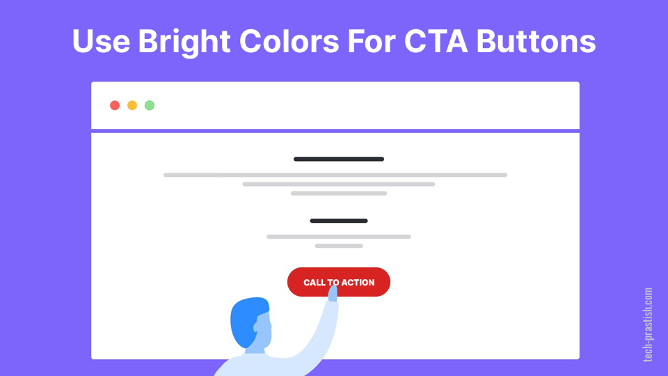
In the marketing world, the key to success is conversions. More visitors clicking on the “Buy Now” or “Subscribe Now” buttons means more leads.
You might have seen that most brands usually prefer reds, blues, and greens for call-to-action (CTA) buttons. This is because they get the most attention. Experts recommend bright primary colors for call-to-action (CTA) buttons.
In addition to color, pay close attention to contrast and CTA content as they are key factors affecting conversion.
Learn About Color Combinations
Color psychology is more than just selecting the colors for your websites. Instead, it’s to learn about which color combinations work best, placement of particular colors, whitespace, etc.
Most web designers follow the 60 30 10 decorating rule. It means, filling 60 percent of web design with a main, dominant color, 30 percent with the secondary color, and 10 percent with the one, which contrasts these two colors.
Developing The Best Color Scheme For Your Website
In the website design process, selecting the color scheme is a challenging task.
In addition to picking colors, you also need to consider how primary and secondary colors will fit together. In other words, you need to learn how to mix colors together. Here’s a quick guide to for color scheme-
Triadic
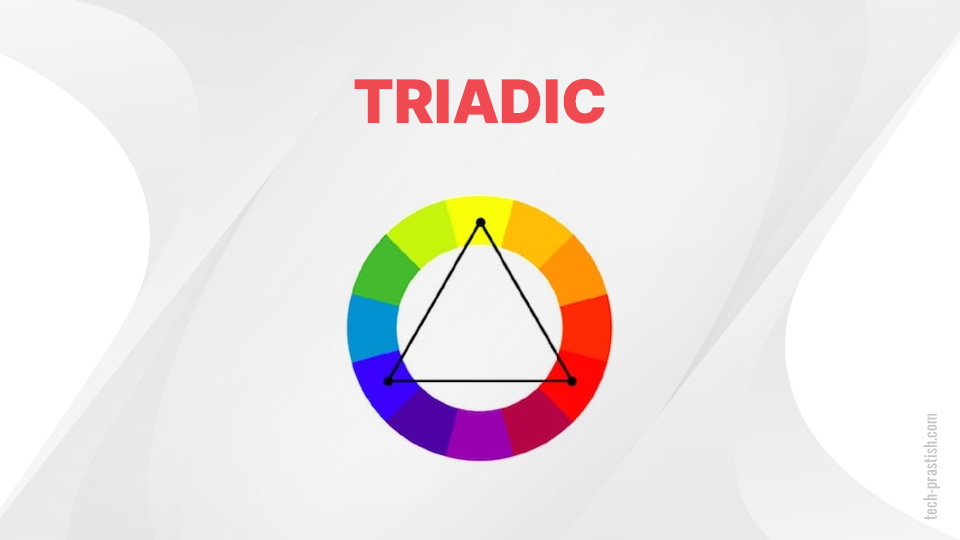
It’s one of the basic methods, which enables you to select three colors located at 120 degrees away from each other on the 12-color wheel [check the image above]. For instance, yellow, blue and red. You can use the selected colors for content, navigation and background.
Tetradic
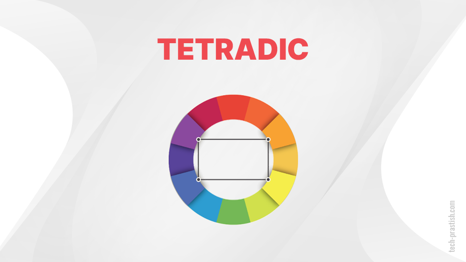
This color combination involves colors that are equidistant apart as in the case of triadic. Place a rectangle on the color wheel, and select the colors at each corner [check the image above].
The basic tetradic colors are-
➔ Red, orange, blue, and green
➔ Yellow, orange, blue, and purple
➔ Vermillion, amber, teal, and indigo
➔ Indigo, magenta, magento, and chartreuse
Complementary
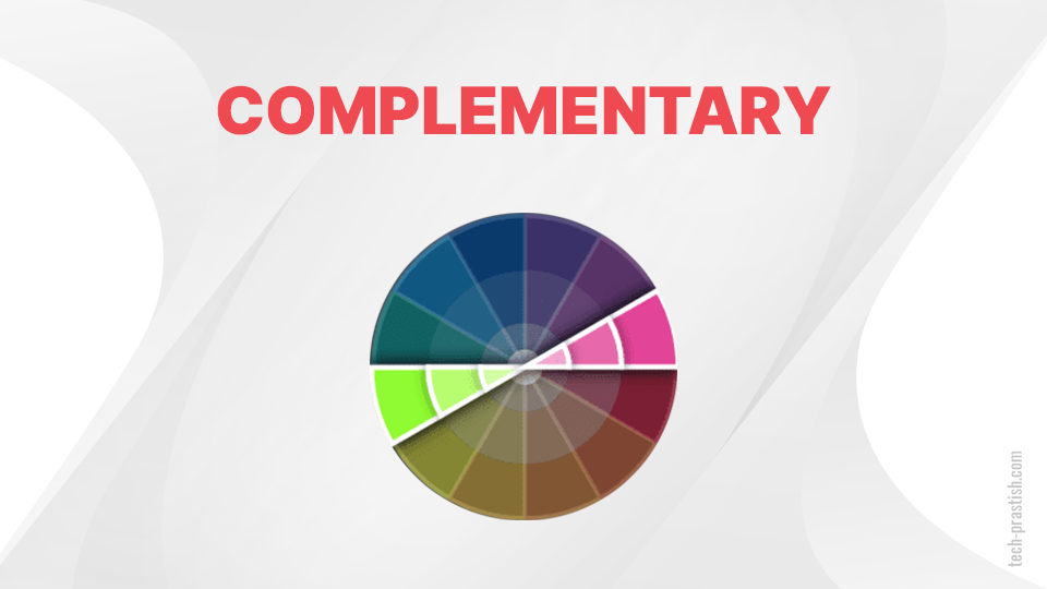
In the complementary color scheme, the colors at the opposite sides on the color wheel are considered for website design. Since these colors strengthen contrast, they can easily attract attention.
Compound (Split-Complementary)
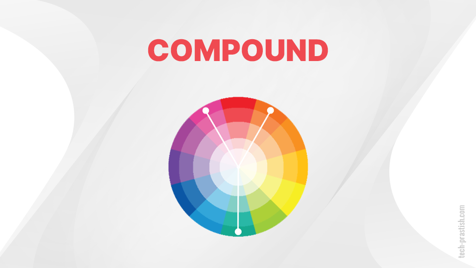
The compound color scheme enables you to choose one color and two colors adjacent to its complementary color. Using this scheme, you can create an interesting color palette for your website.
Analogous
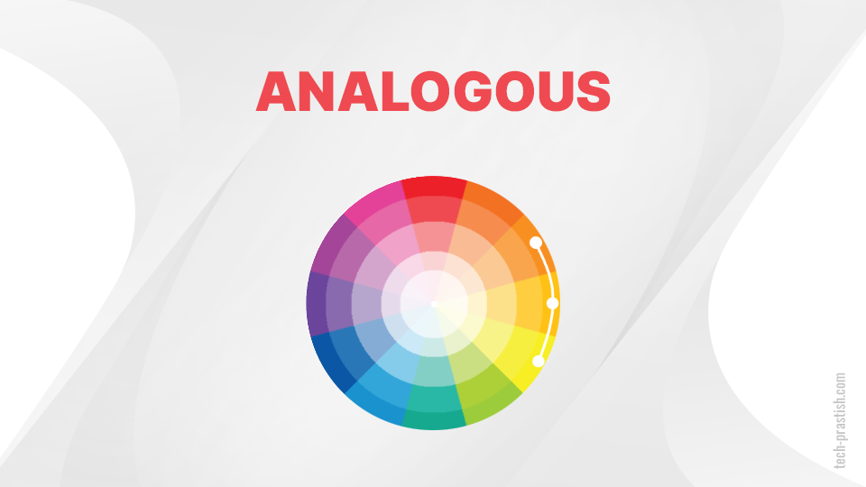
As the name suggests, analogous color scheme means using colors that are next to each other on the color wheel. Here are a few examples of this color scheme-
➔ Yellow, yellow-green, and green
➔ Red, red-orange, and orange
➔ Blue, blue-violet, and violet
Want to learn more about this color scheme? Check out the analogous color scheme generator.
Tools to Help You Choose the Right Colors
Now, you have learned about the basics of color psychology, color schemes, and the step-by-step guide to choose the right colors for your website. Let’s discuss some of the finest tools to select colors-
➔ Adobe Color CC
➔ Colordot
➔ Paletton
➔ Flat UI Color Picker
➔ Mudcube Color Sphere
➔ Color
➔ Check My Colours
➔ Canva
➔ Dribbble
➔ Khroma
➔ Colorspace
Key Takeaways
Whether you are designing a new website or updating the existing one, choosing the right color scheme is important. Studies have shown that colors influence customers’ buying decisions.
The first step to select the best colors for your website is to analyze your target audience. Develop a strong understanding of the psychology behind each color, and see which ones will work best for your website.
Need professional help for choosing your website color scheme? Get our web designing services today. Just submit a form online and get a free quote.