
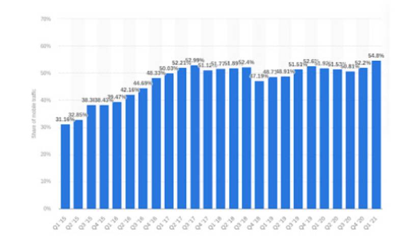
In the past decade, mobile devices have gained popularity among internet users. In the first quarter of 2021, mobile devices accounted for about 54 percent of the global web traffic. By 2025, it’s expected to reach 72.5 percent.
With such a steep rise in mobile users, it has become important to adopt the new website development methods such as mobile-first approach.
In this blog post, we are going to discuss what is the mobile-first design, why it is important, and how to implement it?
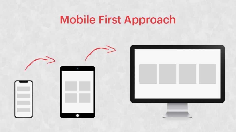
What is Mobile-First Approach (MFA)?
The mobile-first approach was introduced by Luke Wroblewski in 2010. It encouraged web designers to focus on starting the website design process for mobile devices first and then adding more functionalities for desktops.
In simple words, you should optimize your website for mobile devices to improve user experience. No doubt, if your users get what they want easily, they are more likely to buy your services or products.
Many people confuse mobile-first with mobile-friendly. These terms seem similar, but actually, they have different meanings. A mobile-friendly website is optimized in such a way that its content fits perfectly on users mobile devices (smartphones, iPads, or tablets). Thus, users can easily read and navigate it without changing settings manually. But, a mobile-first website is built for mobile devices and then optimized for desktops.
Why is Mobile-First Design Important?
Earlier, websites were designed primarily for desktops, so it was called the desktop-first approach. The main downside of this approach is that most of the animations & other elements don’t work or settle on the right places in mobile devices. This ruins mobile users’ experience. And, to make the website mobile-friendly, developers have to eliminate some of the important elements. Mobile-first approach can help overcome these issues.
Another major reason why you should adopt the mobile-first approach is that mobile accounts for more than half of web traffic. So, making your digital products easily accessible to mobile users means offering them a better user experience.
Additionally, taking the mobile-first route can help you improve your website’s search engine ranking. Google has announced to enable mobile-first indexing by default. All websites launched after July 2019 will automatically go to mobile-first indexing.
Best Practices For Mobile-First Design
Here are the best practices to implement mobile-first design for your website-
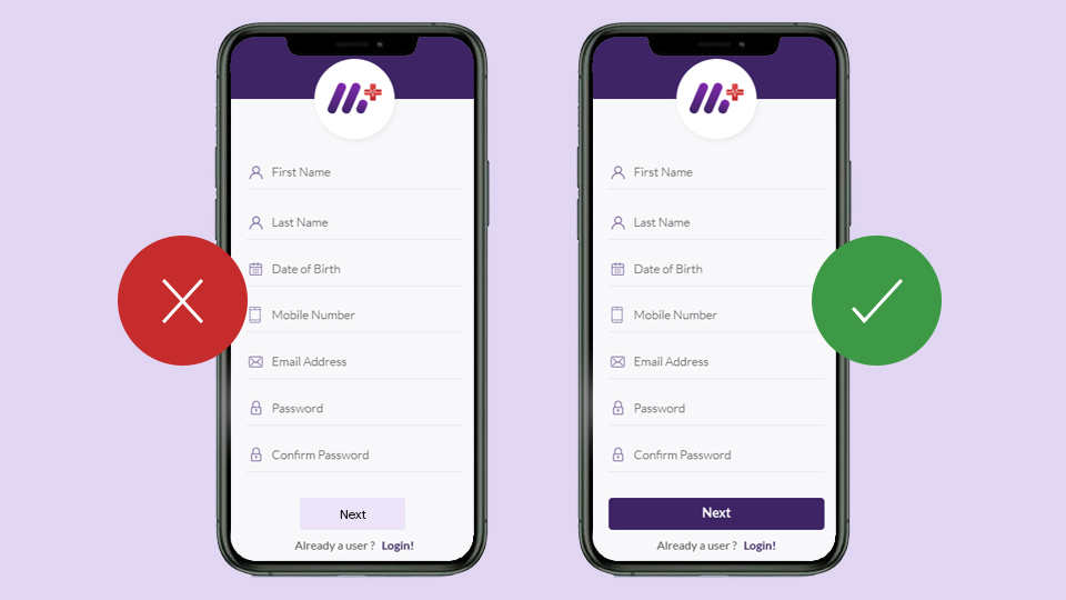
Prioritize Content
When it comes to the mobile-first design, the first step is to set content priorities. In other words, you need to sort information into different categories, such as primary, secondary, and tertiary content.
Since there are space restrictions on mobile devices, you should display important information first. For instance, if you are designing a website for a restaurant, you
must consider what a mobile user will expect after they land on it. Clearly, you must add primary things (such as location, operating hours, contact details, etc.) to the website.
Make it Easy to Navigate

Navigation is one of the important factors for a website’s success. Poor navigation can cost you visitors and conversions. So, you should design your website in such a way that visitors can easily navigate between pages.
In simple words, your website should be easily accessible to mobile users. Your visitors should know where to find what they want.
When designing a website for mobile users, you should include the fewest possible options in the navigation bar. Thus, you can add links of secondary content to the navigation buttons. One way to do so is to use a hamburger menu.
Keep The Design Simple
When people access the web through their mobiles, they use their thumbs to navigate, not the mouse. So, make sure you keep everything on your website easily reachable.
When it comes to mobile-first design, simplicity is the key. Imagine a user comes to your website to get your contact details. If you keep showing them pop-ups or ads, they will get frustrated and eventually leave your website. So, avoid using trendy desktop features when creating a mobile-first website.
Load Time
Website speed plays a key role in user experience. If your site is taking too long to load, more than a quarter of your visitors will click away. So, to make a website ready for mobile-first indexing, optimizing site speed is one of the important steps.
Google AMP (Accelerated Mobile Pages) is effective in optimizing a website for mobile devices and improving its speed. It uses pared-down HTML, which helps web pages load faster. Also, Google keeps the website content in the cache, thus improving the load time even more.
Moreover, features of PWAs (Progressive Web Apps) such as offline support can help improve website performance, speed, and user retention rates. A leading B2B trading platform Alibaba.com reported a 76 percent increase in total conversions by upgrading their website to a PWA.
Note: You can use PageSpeed Insights to check your website speed for both mobile and desktop.
Design & Place Call-to-Action (CTA) Strategically
CTAs define the actions you want your visitors to perform. So, you should design and use them carefully. A poorly designed CTA can confuse your visitors and prevent them from taking the desired action.
Here are some quick tips for creating CTA buttons for mobile-first web design-
- Place the first CTA button above the fold
- Choose the right color & font to make your CTA stand out on mobile devices
Test Your Website on Multiple Devices
If a website performs well on one device, it doesn’t mean that it will give the same experience on other devices. So, to ensure that your website is delivering users with the best experience, make sure you test it on multiple real mobile devices. Check if your website is providing what your mobile users are looking for and if text and images are easy to read.
A wide range of smartphone devices are released every year. So, you should keep testing your website regularly.
Final Thoughts
Mobile-first web design approach means building websites for mobile devices and then optimizing them for desktops. To improve your website’s mobile user experience, prefer displaying primary components first. You can add secondary content to the navigation bar. Other methods to implement the mobile-first approach are-
- Make all the web pages easy to navigate
- Optimize site speed on mobile
- Design and place call-to-action buttons in a thumb-friendly manner
- Avoid using disruptive pop-ups and ads
- Test your website on multiple mobile devices regularly
So, that was all about the mobile-first web design approach. Implement it for your website, and improve its user experience. Hire our web designers for professional website design services.